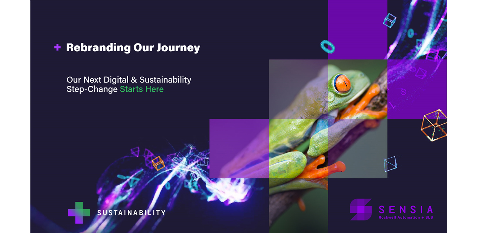


SENSIA: Sustainability Rebrand
SENSIA: SUSTAINABLE INTELLIGENT ACTION
The Need:
Sensia originally tasked us to brand the visuals to align the company’s look with its methods and messaging for sustainable action. After some deep brainstorming, the conclusion was made that it would be a much more effective strategy if the company logo were changed completely to align with sustainability, as opposed to just creating some sustainability-based graphics to accompany the old logo.
The Challenge:
Sensia’s existing branding was already established and strong, so our challenge was to come up with a completely new mark that had the sustainability message built into it, while keeping the parameters of the existing branding. The new sustainability message had to easily and comfortably fit right in.
The Solution:
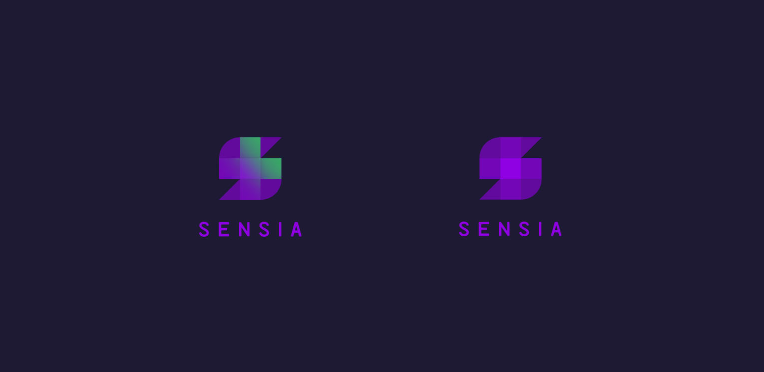
For the main company logo, we came up with a number of options. The “S” mark shown above was chosen by the Sensia team and was also, in fact, our favorite. This incorporated Sensia’s already-known theme of Digital Solutions for the oilfield while having the message of sustainability embedded into it.
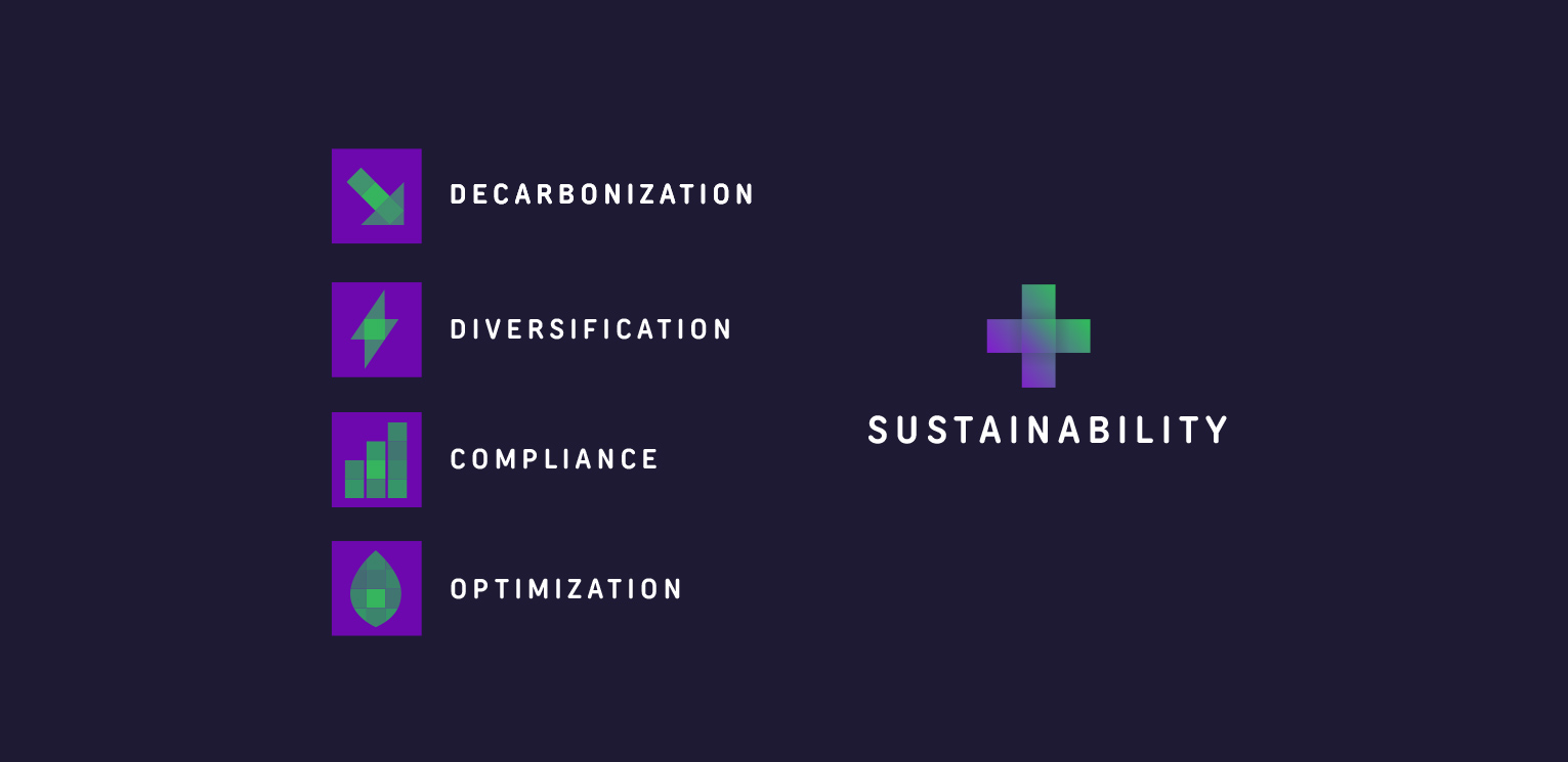
Sensia’s well known and used Plus sign is at the core of the mark. This is where the sustainability message is incorporated. Each square on the outside of the plus represents the 4 facets of Sensia’s Sustainability message – as listed below. The illustration style of the plus is also made of pixels – going back to Sensia’s digital solutions.
Sustainability is at the core of everything Sensia does. It is in the center of the 4 facets of Sustainability, represented by the outer 4 pixels that make up the plus:
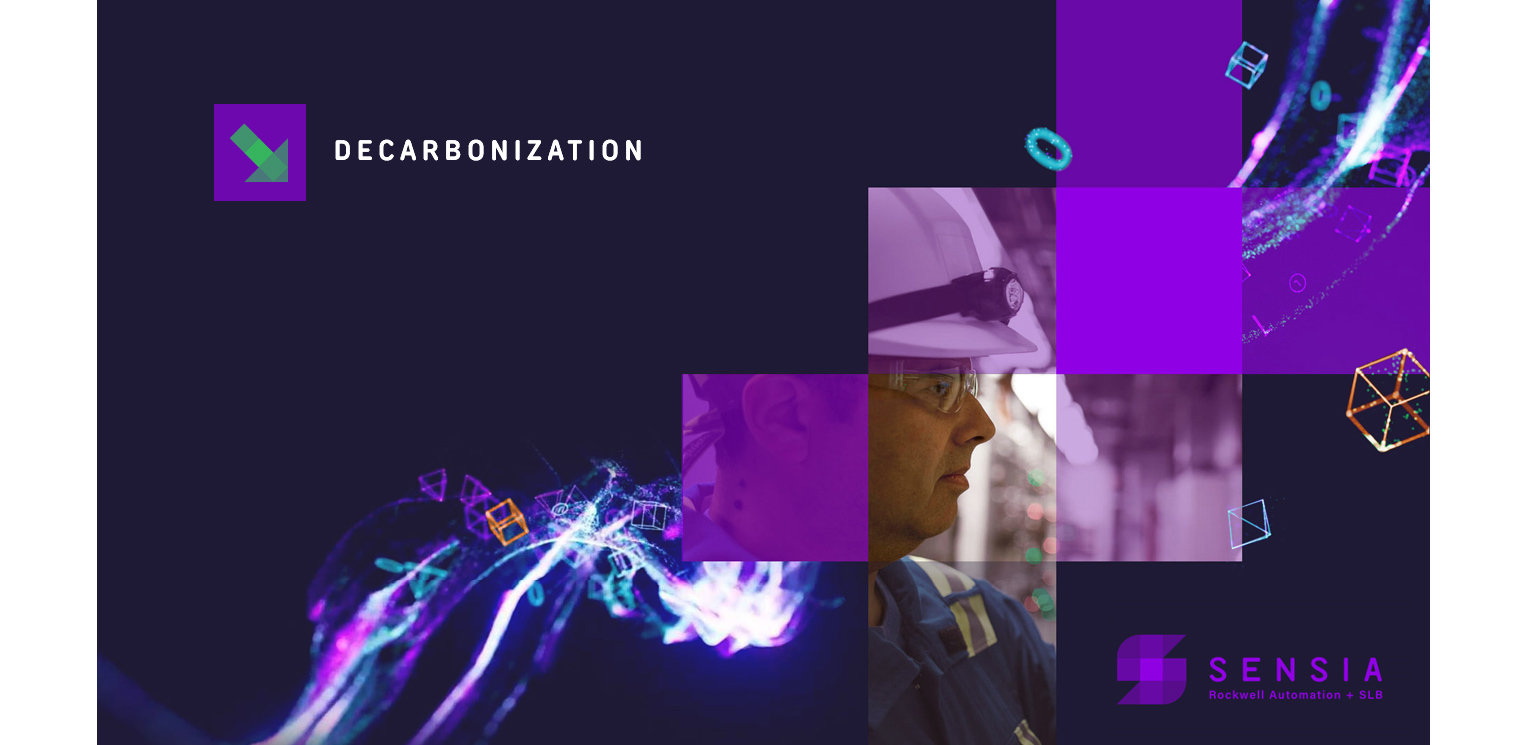
+ Decarbonization
+ Energy Transition
+ Reporting & Compliance
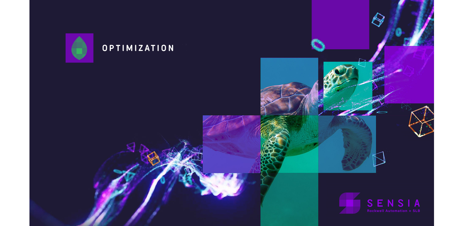
+ Optimize & Conserve
The 4 icons representing the facets of Sustainability combine to create the Sustainability icon. The Sustainability icon easily morphs into the Sensia logo, as Sustainability is at the core of everything Sensia does.
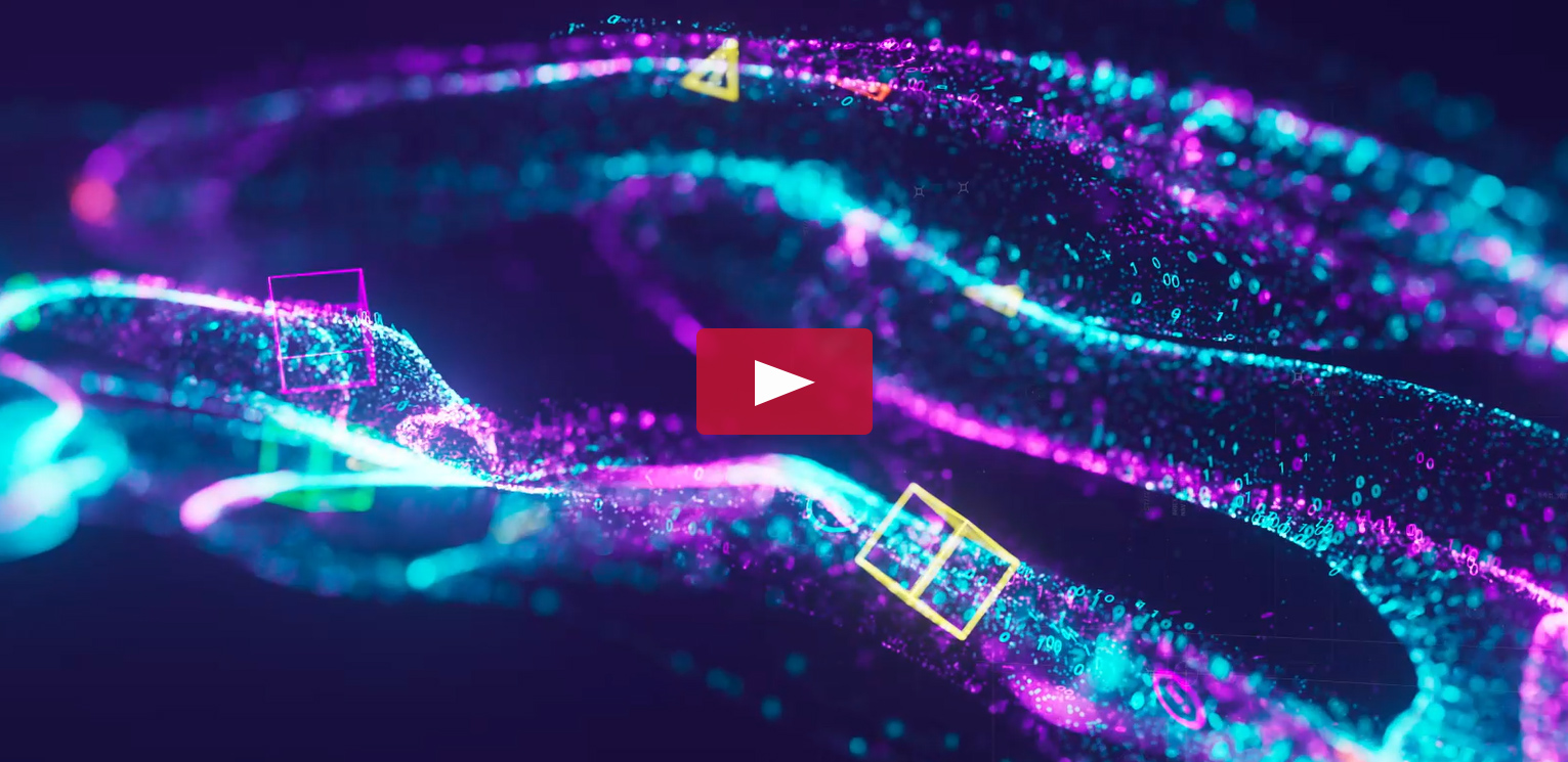
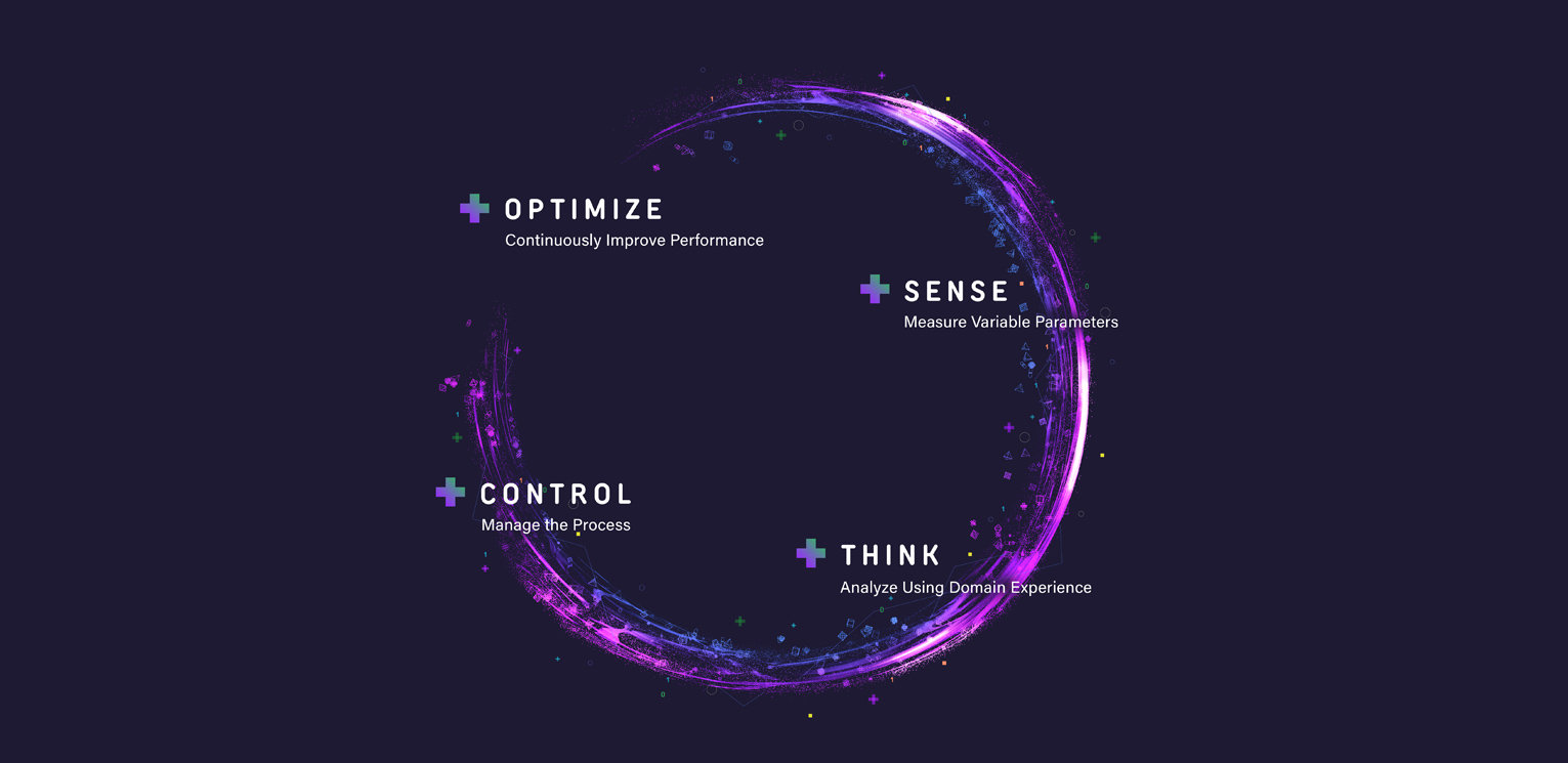
Once the main logo, and the sustainability icons were finalized, we created a graphical look and feel for them to base future layouts on. We also created a logo animation. In the animation we maintained Sensia’s circle Intelligent Action concept outlining the pillars of their business process as a base. Then created a robust particle system to emulate traveling data pulled from sensors and hardware in the field.
We had a blast working with the smart folks at Sensia and know that this brand, the supporting graphical style, and the story it tells is going to be very successful.
Learn more about the Sensia Sustainability Pillars powering your next sustainability step-change.
Production:
Logo, Accompanying Marks, Graphical Look & Feel, 3D, Motion Graphics